GALTON AI Assets · V1.2 · Updated
Confident, editorial, high-contrast.
One source of truth for the GALTON brand — read by humans on this page and by AI agents over MCP. Everything below is generated live from the brand’s Markdown, so it never drifts from the spec.
For AI agents
Three ways to consume GALTON
The same brand, served to whatever tool your team uses. Web agents read a URL; coding agents connect over MCP; everyone can drop the DESIGN.md straight into a repo.
1 · Web (Gemini, ChatGPT)
Paste a link into any web AI and ask it to design on-brand.
https://galton-ai-assets.vercel.app/llms.txt
https://galton-ai-assets.vercel.app/design.md
2 · MCP (Claude, Codex, Cursor)
Add the server; the agent gets live tools to query tokens, components and assets.
{
  "mcpServers": {
    "galton-design": {
      "url": "https://galton-ai-assets.vercel.app/api/mcp"
    }
  }
}
3 · DESIGN.md in-repo
Drop the spec into a project root so any coding agent generates on-brand UI.
curl -O https://galton-ai-assets.vercel.app/design.md
# place at repo root, then prompt your agenthttps://galton-ai-assets.vercel.app/api/mcp01 — Overview
Overview
GALTON Brands is a dark-first, editorial, high-contrast brand system. The page floor is a near-black canvas (#1A1A1A — #1A1A1A), text is white (#FFFFFF), and a single signature primary yellow (#FFD700 — #FFD700) carries every accent — CTAs, highlights, focus rings, the hero word. Yellow is never a large fill; on a yellow surface text is always black (#1A1A1A).
Everything is set in one typeface — Galton — at Light (300) in Sentence case. Weight steps up to Medium (500) / Bold (700) only for emphasis; the brand never shouts in uppercase except for the eyebrow label, button labels and the badge. Where Galton can't be embedded (email, Google Docs/Slides, system contexts), Montserrat is the official substitute — it is last in every font stack. Hierarchy is created by size and a leading ratio (Headline ×1.1, Subhead ×1.2, Body ×1.5), not by heavy weights.
The component language is pill-and-flat: buttons are full pills (100px), uppercase, Galton Bold; inputs are flat (0px), transparent, bottom-border only, with a primary-yellow focus. The palette is fixed — no invented shades; raised surfaces are built from white at low opacity (rgba(255,255,255,0.04)), never a new hex.
Key Characteristics:
- Dark-first canvas
#1A1A1A(#1A1A1A) with white type. Light surfaces invert to black-on-white. - One typeface, Galton Light (300), Sentence case. Montserrat is the official substitute. No second display face.
- A single accent:
#FFD700(#FFD700). Used sparingly — CTAs, focus, highlights, the hero accent. Never large fills. - The logo is white or black ONLY — never yellow/primary or any other color. This is a hard rule.
- Buttons are pill-shaped, uppercase, Bold 700; the signature CTA is
{component.button-yellow}. - Inputs are flat (radius 0), transparent, bottom-border only; focus turns the border
#FFD700. - Fixed palette, no invented shades. Raised surfaces come from white/grey at low opacity.
02 — Colors
Colors
Primary palette
Secondary palette
Semantic tokens
How the palette is applied across the UI. Reference these as {colors.name} — they resolve to the brand colours above (or a grey derived from black/white at opacity).
Brand palette
The brand has three colours, in two groups:
- Primary palette — White (#FFFFFF) and Black (#1A1A1A). The base of the system: black is the dark-first canvas, white is the ink.
- Secondary palette — Yellow (#FFD700). The single accent: CTAs, highlights, focus rings, the hero word. Used sparingly, never a large fill; on a yellow surface, foreground is always black (#1A1A1A).
Everything else (#999999, rgba(255,255,255,0.12), rgba(255,255,255,0.04), body opacities) is a UI grey derived from black/white at opacity — not a new brand colour.
Surface
- Canvas (
#1A1A1A— #1A1A1A): The default page floor on every dark surface. The brand is dark-first. - Surface Raised (
rgba(255,255,255,0.04)— white @4%): Cards, modals, raised panels. Built from white at low opacity over the canvas — never a new hex. Pair with argba(255,255,255,0.12)border. - Hairline (
rgba(255,255,255,0.12)— white @12%): 1px dividers, table rows, card outlines, the top/bottom bars. - Light Canvas (
#FFFFFF— #FFFFFF): The floor for light surfaces (cards on light, print, email).
Text
- Ink / On Dark (
#FFFFFF— #FFFFFF): Headlines and primary text on the dark canvas. - Body (
rgba(255,255,255,0.8)— white @80%): Default running body text — slightly softened from pure white. - Body Soft (
rgba(255,255,255,0.78)— white @78%): Secondary paragraphs and section leads. - Muted (
#999999— #999999): Captions, metadata, placeholders, disabled states, dividers. - On Light (
#1A1A1A— #1A1A1A): Text and marks on a white/light surface.
Usage Rules
- Default page =
#1A1A1Abackground,#FFFFFFtext. #FFD700is for emphasis only — never a large fill. On a primary surface, text is always black.- Keep the secondary yellow to accents only — never a large fill.
- Need a raised surface? Build it from white/grey at low opacity (
rgba(255,255,255,0.04)) — do not introduce a new hex. - Selection highlight is primary-on-black.
Combinations
Combinations
03 — Typography
Typography
- Family
- Galton
- Default
- 300 · Sentence case
- Weights
- 100 Thin · 300 Light (default) · 400 · 500 · 700 · 800 · 900
- Fallback
- Montserrat
- · 100–900· variable — prefer this on the web
- · 300· static — the brand default
- · 400
- · 500
- · 700
@font-face {
  font-family: "Galton";
  src: url("https://galton-ai-assets.vercel.app/brand/fonts/GaltonVariable.woff2") format("woff2-variations");
  font-weight: 100 900;
  font-style: normal;
  font-display: swap;
}
Setting type
When setting type, the leading should be consistent across applications. Leading refers to the space between lines of text. Leading = type size × ratio.
Type size × 1.1 = leading. Headlines at 80pt would have 88pt leading.
Type size × 1.2 = leading. Subheads at 30pt would have 36pt leading.
Type size × 1.5 = leading. Body copy at 18pt would have 27pt leading.
Hierarchy
Size, scale and position all play a factor in how information is read. Always ensure there is a purposeful difference between type sizes. Type sizes are examples only.
Confident headlines, set in Galton Light.
Subheads carry a clear, secondary voice beneath the headline.
Body copy holds the detail at a comfortable measure, with a leading ratio that keeps long passages easy to read across the page.
All type styles
The quick brown fox
The quick brown fox
The quick brown fox
The quick brown fox
The quick brown fox
The quick brown fox
Section label
Button label
The quick brown fox
Section label
Font Family
The system runs one typeface — Galton — for both headings and body. The variable woff2 covers weights 100–900; static cuts (Thin…Black) exist as a fallback. The default is Light (300), set in Sentence case at normal tracking.
Montserrat is the official substitute: use it wherever Galton can't be embedded (email, Google Docs/Slides, system contexts). It is last in every font stack: Galton, Montserrat, ui-sans-serif, system-ui, sans-serif. There is no second brand face — Galton does everything.
Weights: 100 Thin · 300 Light (default) · 400 Regular · 500 Medium · 700 Bold · 800 Extrabold · 900 Black. There is no dedicated 600 cut — use the variable font for weight 600 (e.g. a live-text wordmark).
Font source & embedding
The Galton typeface ships with this package — don't substitute a lookalike. Load the variable woff2 (one file, weights 100–900):
- File:
https://galton-ai-assets.vercel.app/brand/fonts/GaltonVariable.woff2(static cuts:https://galton-ai-assets.vercel.app/brand/fonts/Galton-{Thin,Light,Regular,Medium,Bold,Extrabold,Black}.woff2) - Base URL:
https://galton-ai-assets.vercel.app/brand/(resolved to wherever this is deployed) - Hotlink these absolute URLs exactly as given — the files are served with permissive CORS (
Access-Control-Allow-Origin: *), so a cross-origin@font-faceworks. Do not relativise them to/brand/fonts/…(that resolves against your host and 404s, silently falling back to Montserrat) and don't copy the file locally.
@font-face {
  font-family: "Galton";
  src: url("https://galton-ai-assets.vercel.app/brand/fonts/GaltonVariable.woff2") format("woff2-variations");
  font-weight: 100 900;
  font-style: normal;
  font-display: swap;
}
Then use the stack Galton, Montserrat, ui-sans-serif, system-ui, sans-serif. Montserrat is the substitute and loads from Google Fonts (https://fonts.google.com/specimen/Montserrat) — it is last in the stack and only kicks in where Galton can't be embedded. The full fonts block in the frontmatter lists every file, format and the ready-to-paste @font-face.
Hierarchy
All Galton Light (300), Sentence case. Leading (line-height) is a ratio of the type size. Display sizes are responsive; the token value is the desktop maximum.
| Token | Size (responsive) | Weight | Line Height | Letter Spacing | Use |
|---|---|---|---|---|---|
{typography.display-lg} | 56 → 88 → 136 → 180px | 300 | 1.05 | 0 | Jumbotron / extreme display |
{typography.display} | 48 → 72 → 96 → 120px | 300 | 1.1 | 0 | Large hero headline |
{typography.headline} | 40 → 52 → 64 → 80px | 300 | 1.1 | 0 | Headline (size ×1.1) |
{typography.subhead} | 22 → 24 → 30px | 300 | 1.2 | 0 | Subhead (size ×1.2) |
{typography.body} | 18px | 300 | 1.5 | 0 | Body — the web/body minimum (never below 18px) |
{typography.body-strong} | 18px | 500 | 1.4 | 0 | Emphasis inside body |
{typography.eyebrow} | 15px | 500 | 1.4 | 0.22em | Section label — uppercase overline above headlines, primary color |
{typography.button} | 18px | 700 | 1.0 | 0 | Uppercase button labels (web/body minimum) |
{typography.label} | 18 → 24px | 300 | 1.4 | 0 | Form labels |
{typography.badge} | 15px | 400 | 1.0 | 0.08em | Uppercase pill chip (the global 15px minimum) |
Principles
Emphasis comes from size and leading, then a small step in weight (300 → 500/700) — never from uppercase body copy. The rule of thumb for any new size: Headline ×1.1, Subhead ×1.2, Body ×1.5 leading, with a purposeful jump between levels.
Uppercase appears in exactly three places: the eyebrow label, button labels, and the badge. Everything else is Sentence case.
Note on Font Substitutes
If Galton is unavailable, fall back to Montserrat (Google Fonts) — the official substitute, already last in every stack. Montserrat is a geometric sans close to Galton in proportion; keep the Light (300) default and Sentence case. Do not substitute a serif or a condensed face.
04 — Elevation & Depth
Elevation & Depth
| Level | Treatment | Use |
|---|---|---|
| Flat | No shadow, no border | Body, top nav, footer, most sections |
| Hairline | 1px rgba(255,255,255,0.12) border | Section dividers, table rows, card outlines |
| Raised surface | rgba(255,255,255,0.04) (white @4%) + hairline border | Cards, modals, panels — no drop shadow |
| Accent glow | Radial primary tint at very low opacity | Optional hover halo on a feature panel only |
The system avoids drop shadows and gradients. Depth comes from the contrast between the near-black canvas and a barely-raised white-at-opacity surface, plus the hairline. Do not add material-style elevation shadows.
05 — Shapes
Shapes
Border Radius Scale
| Token | Value | Use |
|---|---|---|
0px | 0px | Inputs, textareas, selects, checkboxes — always flat |
10px | 10px | Small UI elements |
20px | 20px | Standard card / media container |
24.5px | 24.5px | Large icon-card |
100px | 100px | Buttons, tags, chips, the badge |
The radius language is intentional: form controls are flat (0px); interactive pills are fully round (100px); content containers are softly rounded (20px). Avoid arbitrary in-between radii.
06 — Components
Components
Form elements
Dark-first: transparent, flat (radius 0), bottom-border only. Focus turns the border the signature yellow. Labels are Galton Light.
⌄ Token reference (4)
| Component | Property | Token | Resolved |
|---|---|---|---|
| text-input | backgroundColor | transparent | transparent |
| text-input | textColor | {colors.ink} | #FFFFFF |
| text-input | typography | {typography.body} | {typography.body} |
| text-input | rounded | {rounded.none} | 0px |
| text-input | padding | 0 | 0 |
| text-input | height | 53px | 53px |
| text-input | border | 0 0 1px 0 solid {colors.ink} | 0 0 1px 0 solid #FFFFFF |
| textarea | backgroundColor | transparent | transparent |
| textarea | textColor | {colors.ink} | #FFFFFF |
| textarea | typography | {typography.body} | {typography.body} |
| textarea | rounded | {rounded.none} | 0px |
| textarea | padding | 12px 0 | 12px 0 |
| textarea | height | 120px | 120px |
| textarea | border | 0 0 1px 0 solid {colors.hairline} | 0 0 1px 0 solid rgba(255,255,255,0.12) |
| select | backgroundColor | transparent | transparent |
| select | textColor | {colors.muted} | #999999 |
| select | typography | {typography.label} | {typography.label} |
| select | rounded | {rounded.none} | 0px |
| select | padding | 0 30px 0 0 | 0 30px 0 0 |
| select | height | 53px | 53px |
| select | border | 0 0 1px 0 solid {colors.ink} | 0 0 1px 0 solid #FFFFFF |
| checkbox | backgroundColor | transparent | transparent |
| checkbox | textColor | {colors.ink} | #FFFFFF |
| checkbox | rounded | {rounded.none} | 0px |
| checkbox | size | 30px | 30px |
| checkbox | border | 1px solid {colors.ink} | 1px solid #FFFFFF |
Cards & surfaces
Raised from white at low opacity over the canvas, hairline border, 20px radius — no drop shadows. Depth comes from contrast, not material elevation.
Card title
A raised surface built from white at low opacity over the canvas, with a hairline border.
Feature
With an eyebrow
Lead with a small uppercase label, then a Sentence-case title and body.
Learn more →20px
Card radius
⌄ Token reference (1)
| Component | Property | Token | Resolved |
|---|---|---|---|
| card | backgroundColor | {colors.surface-raised} | rgba(255,255,255,0.04) |
| card | textColor | {colors.ink} | #FFFFFF |
| card | rounded | {rounded.card} | 20px |
| card | padding | 28px | 28px |
| card | border | 1px solid {colors.hairline} | 1px solid rgba(255,255,255,0.12) |
Links, eyebrow & badge
Small text utilities. Links hover to yellow; eyebrow and badge are the only Sentence-case exceptions (uppercase).
⌄ Token reference (3)
| Component | Property | Token | Resolved |
|---|---|---|---|
| text-link | backgroundColor | transparent | transparent |
| text-link | textColor | {colors.ink} | #FFFFFF |
| text-link | typography | {typography.body} | {typography.body} |
| eyebrow | backgroundColor | transparent | transparent |
| eyebrow | textColor | {colors.primary} | #FFD700 |
| eyebrow | typography | {typography.eyebrow} | {typography.eyebrow} |
| badge | backgroundColor | transparent | transparent |
| badge | textColor | {colors.muted} | #999999 |
| badge | typography | {typography.badge} | {typography.badge} |
| badge | rounded | {rounded.pill} | 100px |
| badge | padding | 5.6px 13.6px | 5.6px 13.6px |
| badge | border | 1px solid {colors.hairline} | 1px solid rgba(255,255,255,0.12) |
Navigation
Sticky 56px top bar and the footer — both on the canvas with a hairline edge.
⌄ Token reference (2)
| Component | Property | Token | Resolved |
|---|---|---|---|
| top-nav | backgroundColor | {colors.canvas} | #1A1A1A |
| top-nav | textColor | {colors.ink} | #FFFFFF |
| top-nav | typography | {typography.body} | {typography.body} |
| top-nav | height | 56px | 56px |
| top-nav | border | 0 0 1px 0 solid {colors.hairline} | 0 0 1px 0 solid rgba(255,255,255,0.12) |
| footer | backgroundColor | {colors.canvas} | #1A1A1A |
| footer | textColor | {colors.muted} | #999999 |
| footer | typography | {typography.body} | {typography.body} |
| footer | padding | 72px | 72px |
| footer | border | 1px 0 0 0 solid {colors.hairline} | 1px 0 0 0 solid rgba(255,255,255,0.12) |
Interaction note: buttons and inputs use a standard
easeover ~300–600ms. Hover states are described in prose; default (and focus) states are the source of truth in the YAML.
Top Navigation
top-nav — A 56px sticky bar on #1A1A1A with a blur and a rgba(255,255,255,0.12) bottom border. Carries the wordmark lockup at left — embed galton-wordmark-white.svg (don't retype the letters) — and a set of in-page anchor links + at most one compact secondary (outline) pill CTA at right ({component.button-secondary}, with the button typography). The yellow button does not belong in the persistent nav — keep {component.button-yellow} for the primary in-page CTA (hero, forms). Links are {typography.body} in #999999, brightening to #FFFFFF on hover.
Logo lockup
The white GALTON wordmark (vector SVG, fill="currentColor") plus a superscript ® and a letter-spaced "Brands" tagline beneath. White or black only — the lockup never turns yellow, even on hover. See "Logo & Iconography".
Buttons
All buttons: pill (100px), UPPERCASE, Galton Bold ({typography.button}), inline-flex centered, transition all 0.6s ease. Bottom padding is ~0.1rem less than top (optical compensation for Galton's ascenders). Responsive padding: mobile 10px 20px 8.4px · 1024px 12px 24px 10.4px · 1280px 11px 30px 10px.
button-yellow— The signature CTA.#FFD700background,#1A1A1Atext,#1A1A1Aborder. Hover →#1A1A1Abackground,#FFFFFFtext,#FFFFFFborder.button-primary—#FFFFFFbackground,#1A1A1Atext (on dark surfaces). Hover →#1A1A1Abackground,#FFFFFFtext.button-secondary— Transparent with a#FFFFFFborder (ghost/outline on dark). Hover →#FFFFFFbackground,#1A1A1Atext.
Inputs & Forms
Dark-first: transparent background, bottom-border only, primary-yellow focus. On light surfaces, override the white border/text to black.
text-input— Flat (0px), transparent,#FFFFFFbottom border, height 53px,{typography.body}/400, placeholder#999999. Focus → border#FFD700.textarea— Flat, hairline (rgba(255,255,255,0.12)) bottom border, min-height 120px, vertically resizable. Focus →#FFD700.select— Flat,#FFFFFFbottom border, height 53px,appearance: none. The native arrow is replaced by the brand chevron (grey "V") at the right, padding-right 30px, weight 300,#999999text. Focus →#FFD700. (Sourced from the galton.sk contact form.)checkbox— Flat square (0px),#FFFFFFborder, 30px → 45px@1024, fills with a white square on:checked, focus →#FFD700. Pair with a label in{typography.body}/300 inside a flexform-checkrow.label—{typography.label}(Galton Light),#FFFFFF, block, 8px bottom margin.
Links, Eyebrow & Badge
text-link—color: inherit, no underline, hover/focus →#FFD700(primary). Transitioncolor 0.3s ease.eyebrow— Small uppercase label above headlines:{typography.eyebrow},#FFD700.badge— Neutral pill chip for meta/status/version on dark:{typography.badge},#999999,rgba(255,255,255,0.12)border,100px.
Cards & Containers
card — rgba(255,255,255,0.04) background, rgba(255,255,255,0.12) border, 20px (20px), ~28px padding, no drop shadow. (Detailed card patterns are not yet fully specified — see Known Gaps.)
Footer
footer — #1A1A1A, #999999 text, a rgba(255,255,255,0.12) top border, centered wordmark lockup + copy. ~72px vertical padding. The footer never inverts.
Inversion
Black on white
On a light surface
Black on white, the same system.
GALTON is dark-first, but every surface inverts cleanly for print, email and documents — the neutrals flip, the accent stays.
The logo becomes its black wordmark, type and spacing are unchanged, and the only color that survives the flip is the signature yellow — used just as sparingly.
07 — Logo & Iconography
Logo & Iconography
Two marks
All logo files are served at https://galton-ai-assets.vercel.app/brand/logos/ — hotlink them by their absolute URL (CORS is open). In a header/footer lockup, embed the wordmark SVG, e.g. <img src="https://galton-ai-assets.vercel.app/brand/logos/galton-wordmark-white.svg" alt="GALTON"> — never retype "GALTON" as text to fake the logo. Fetch any file by name below.
- Symbol — the "G":
galton-symbol.svg(fill="currentColor", inherits text colour) — favicon, app icon, avatar, loader, compact mark. Explicit-fill copiesgalton-symbol-white.svg/galton-symbol-black.svgfor raster/email. - Wordmark — "GALTON":
galton-wordmark.svg(vector,fill="currentColor") — the primary digital logo. Explicitgalton-wordmark-white.svg/galton-wordmark-black.svgfor raster; the full GALTON® + BRANDS tagline lockup asgalton-wordmark-white-tagline.png/galton-wordmark-black-tagline.pngfor formal/print.
The hard color rule
The logo is white or black ONLY — never yellow/primary or any other color. When using a currentColor mark, ensure the inherited color is white or black, never #FFD700. White on dark; black on light (or on a primary-yellow surface, where the mark is black). Never recolor, add shadows/gradients/outlines, stretch, rotate, or re-typeset the wordmark.
Favicons
The "G" symbol as a site/app icon (white on transparent), served at https://galton-ai-assets.vercel.app/brand/icons/:
galton-favicon-32x32.png(browser tab),galton-favicon-192x192.png(Android/high-DPI),galton-favicon-180x180.png(Apple touch icon).
Complete asset manifest: every logo, font and icon — with formats, usage notes and direct URLs — is served as JSON at
https://galton-ai-assets.vercel.app/brand.jsonand indexed athttps://galton-ai-assets.vercel.app/llms.txt. This spec carries enough to fetch the brand directly; the manifest is the exhaustive list.
08 — Do's and Don'ts
Do's and Don'ts
Do
- Build dark-first:
#1A1A1Afloor,#FFFFFFtext,#FFD700for accents only. - Set everything in Galton Light (300), Sentence case. Step to 500/700 only for emphasis.
- Nothing renders below 15px on the web — 15px is the hard minimum (section-label
eyebrow,badge, captions, code, table headers). Body/reading text (body, buttons, form labels, links, nav) is 18px. - Keep the leading ratios: Headline ×1.1, Subhead ×1.2, Body ×1.5.
- Use
{component.button-yellow}for the signature CTA; keep all buttons pill + uppercase + Bold. - Keep inputs flat (
0px), transparent, bottom-border only, focus →#FFD700. - Build raised surfaces from white/grey at low opacity (
rgba(255,255,255,0.04)). - Keep the logo white or black, always.
- Hotlink fonts and logos by their absolute
https://galton-ai-assets.vercel.app/brand/…URLs (CORS is open); embed the wordmark SVG for any lockup.
Don't
- Don't color the logo yellow/primary or any color other than white/black. (Hard rule.)
- Don't introduce a new hex for surfaces — derive from white/grey at opacity.
- Don't use
#FFD700as a large fill, or put primary type on white (low contrast). - Don't uppercase body copy — uppercase is for eyebrow, buttons and badge only.
- Don't add drop shadows or gradients for depth; use the canvas/hairline/raised-surface stack.
- Don't round inputs or square the buttons — form controls are 0px, buttons are 100px.
- Don't substitute a serif or condensed face for Galton — fall back to Montserrat only.
- Don't relativise asset URLs to
/brand/…or copy fonts/logos locally — hotlink the absolutehttps://galton-ai-assets.vercel.app/brand/…URL, or the font silently falls back to Montserrat off-site. - Don't fake the logo by retyping "GALTON" as styled text — embed the wordmark SVG.
- Don't put the yellow button in the persistent top nav — the nav CTA is the compact secondary/outline pill; yellow is for the primary in-page CTA.
09 — Responsive Behavior
Responsive Behavior
Breakpoints
| Name | Width | Key Changes |
|---|---|---|
| Mobile | < 768px | Single column; in-page nav links hide (CTA stays); display type drops to the smallest step; section rhythm ~56px; form rows go 1-up |
| Tablet | 768–1024px | Wider gutters (2.5rem); subhead/headline step up; 2-up form rows |
| Desktop | 1024–1280px | Full type scale; gutter 4rem; section rhythm ~104px |
| Wide | > 1280px | Display-lg/display reach their max (180/120px); content max 1080px |
Touch Targets
- Buttons render at a comfortable tap height (≥44px effective).
{component.text-input}and{component.select}are 53px tall.{component.checkbox}is 30px (mobile) → 45px (desktop).
Collapsing Strategy
- Top-nav anchor links hide below 720px; the wordmark lockup and the single pill CTA stay.
form-rowtwo-column grids collapse to one column below ~640px.- Display headlines step down one size per breakpoint; body stays 18px throughout (the web/body minimum).
Image / Mark Behavior
- SVG marks scale crisply at any size; prefer the vector wordmark for digital and the tagline PNG only for formal/print.
10 — Agent Prompt Guide
Agent Prompt Guide
Point your agent at this design system first — connect the MCP server, drop DESIGN.md into the repo, or share the URL. Then describe intent, not values: say on-brand, the signature accent, the display headline, and the agent resolves the exact colours, type and components from the spec. The prompts below are starting points — copy one and adapt it. None of them hard-codes a hex or a size; that's the agent's job, from the guidelines.
Build an on-brand GALTON hero. Dark-first canvas; a large display headline in Sentence case with the final word in the signature accent; a short body lead beneath; and the primary call-to-action button. Place the wordmark top-left. Pull every colour, type size and component from the design system — don't invent values.
Create an on-brand contact form. Stack labelled fields — a text input, a select and a textarea — then a consent checkbox and the primary CTA. Use the form component tokens: flat fields, bottom-border only, focus in the accent. Keep it dark-first.
Compose a full GALTON landing page: a hero, two or three content sections and a footer. Use the design system's type scale, spacing rhythm and components throughout; keep the dark-first canvas and reserve the accent for emphasis. Pull every value from the spec — don't invent any.
Restyle this page to match GALTON. Map every colour, font and component to the design system's tokens and replace ad-hoc values with the brand's. Keep the logo white or black only.
- Describe intent and structure; let the agent resolve exact values from the spec.
- Reference roles — "primary CTA", "the accent", "display headline" — not hex codes.
- Keep the logo white or black only; never recolour it.
- Don't use the accent as a large fill, and never uppercase body copy.
11 — Iteration Guide
Iteration Guide
- Work one component at a time; reference its YAML key (e.g.
{component.button-yellow},{component.select}). - New form controls default to
0px(0px); interactive pills use100px; content containers use20px. - Variants live as separate entries in
components:. - Use
{token.refs}everywhere — never inline a hex or a raw px where a token exists. - Keep the type Galton Light / Sentence case; only the eyebrow, button and badge are uppercase.
- When in doubt about emphasis: more size and leading before more weight; never reach for a new color.
- The logo stays white or black in every state, including hover.
12 — Known Gaps
Known Gaps
- Confirmed from the official manual: palette, typeface, type hierarchy + leading, colour combinations, logo system, corner radius, buttons and forms. Spacing/grid and motion are intentionally left out of this spec — define them per project rather than treating derived values as brand law.
- Sub-brand chip and detailed card patterns are not yet fully specified. Derive them from these principles (dark-first, palette tokens, the radius/motion scales) — or confirm from galton.sk — and add them. (The brand icon library — line / 3d / simple — is specified separately in
icons.jsonand the Icon library section.) - Display token sizes in the frontmatter are the desktop maximum; the full responsive range is in the Typography table.
- Surface tokens (
surface-raised,hairline) are expressed as white-at-opacity rather than fixed hex, matching the brand's "no new hex" rule.
Assets
Logos, fonts & icons

The primary lockup — wordmark + ® and the BRANDS tagline.
Symbol — the “G”
Wordmark — “GALTON”
Full lockup with ® + BRANDS tagline (raster, formal / print)

Fonts
The Galton typeface. Prefer the variable woff2 on the web. Desktop/print cuts (OTF, TTF) live in fonts/desktop/ and legacy web formats (woff, eot, svg) in fonts/legacy/. Montserrat is the official substitute.
Variable font — use this on the web.
Static cut — fallback.
The brand default display weight.
Body / headlines.
Emphasis.
Strong emphasis, buttons.
Extrabold.
Black.
Voice
Brand voice
Confident
Quiet authority — never loud, never hype.
Editorial
High-contrast, considered, magazine-like.
Plain
Sentence case; clarity over cleverness.
Do
- Lead with the reader's problem, then the idea.
- One idea per sentence; let whitespace carry weight.
- Reach for size and leading before weight, and for weight before colour.
- Keep a deliberate jump between hierarchy levels.
Don't
- Don't uppercase body copy.
- Don't stack three adjectives.
- Don't colour the logo or use the yellow as a large fill.
- Don't shout with exclamation marks or all-caps.
Prefer
Avoid
Before → after
We deliver CUTTING-EDGE, world-class branding solutions!!!
We build brands that are confident, editorial, and clear.
enOur revolutionary, game-changing strategy will disrupt your market.
A clear strategy gives your brand a deliberate place in the market.
enPrinášame REVOLUČNÉ a svetové brandingové riešenia!!!
Staviame značky, ktoré sú sebavedomé, editoriálne a jasné.
skNaša prelomová stratégia naruší celý trh.
Jasná stratégia dá vašej značke premyslené miesto na trhu.
skLinkedIn playbook
Educational carousel
Teach one concept across slides.
Recipe: educational-carousel
600–1200 chars
Single insight
One sharp idea, one image.
Recipe: single-insight
300–700 chars
Announcement
Ship / launch news.
Recipe: announcement
Event / speaker
Promote a talk or event.
Recipe: event-post
Naming showcase
Show a naming case.
Recipe: naming-carousel
Hashtags
3–5, lowercase, brand + topic; never a wall of tags.
Formatting
- The hook must stand alone — LinkedIn truncates after ~2 lines.
- Short paragraphs, one idea each; a blank line between.
- End with a single clear call to action.
Example posts
New product, new market, new challenge.

Most launches fail on positioning, not product.

Here's how a go-to-market strategy fixes that ↓

#galtonbrands #gtm #branding
Your brand isn't your logo.

It's the deliberate gap between you and everyone else.

#galtonbrands #branding
Nový produkt, nový trh, nová výzva.

Väčšina launchov padne na pozícii, nie na produkte.

Ako to rieši go-to-market stratégia ↓

#galtonbrands #gtm #branding
Značka nie je vaše logo.

Je to premyslený rozdiel medzi vami a všetkými ostatnými.

#galtonbrands #branding
Layouts
Layout archetypes
get_slide_canvasvertical-central · gap auto · top / bottom blocks
folio — Two small folio labels — left + right — above a hairline rule (e.g. 'Naming folio' / 'Selected works').wordmark — GALTON wordmark at left; an optional event-tag pill at right.symbol — The G symbol at left and the website URL at right, separated from content by a hairline rule.award — The Najzamestnávateľ award lockup at left and the website URL at right.coverSlots: folioLeft, folioRight, headline, accent, subtitle, surface
profileSlots: tag, photo, people, surface
conceptSlots: headline, subheadline, graphic, surface
statementSlots: headline, graphic, subtitle, cta, surface
Icons
Icon library
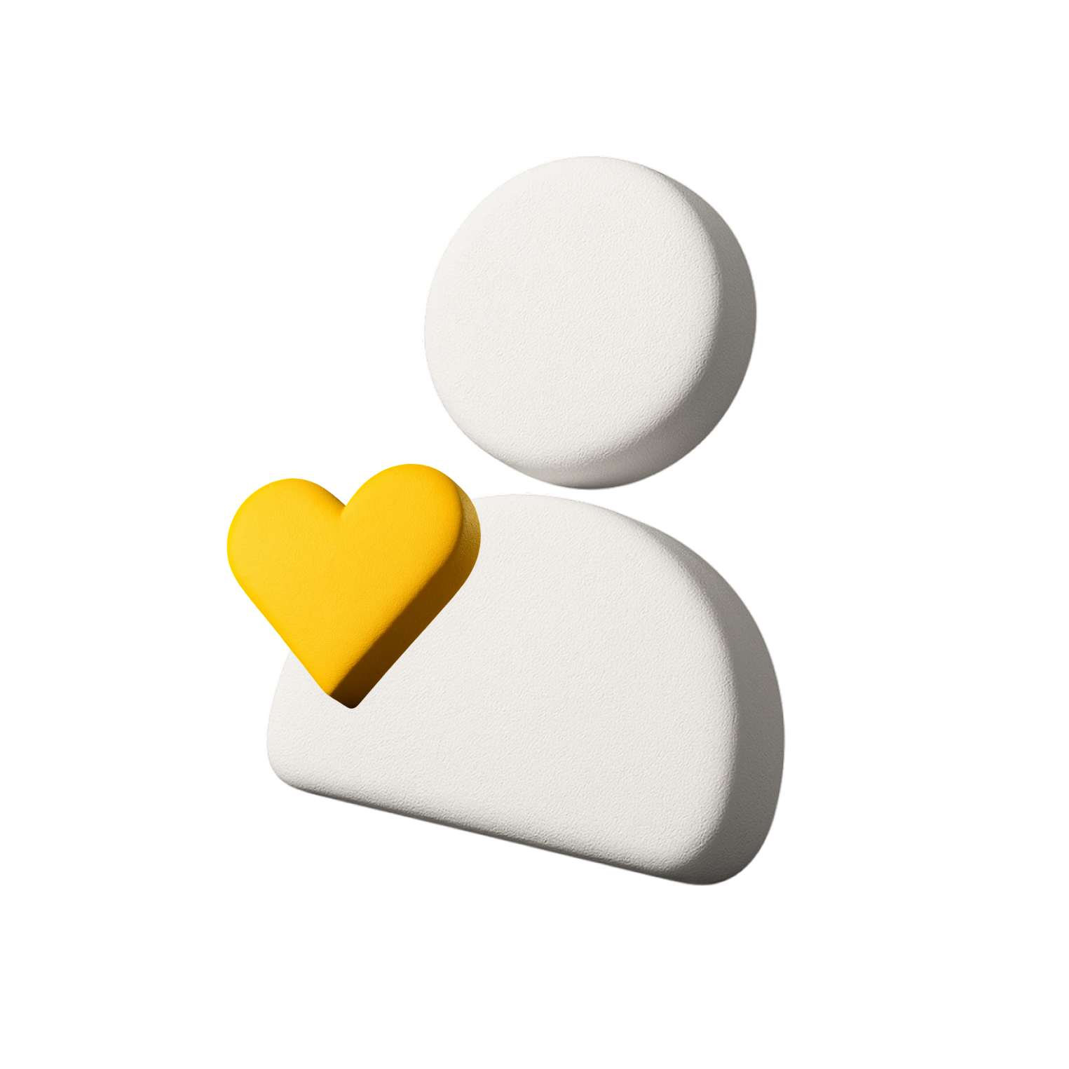
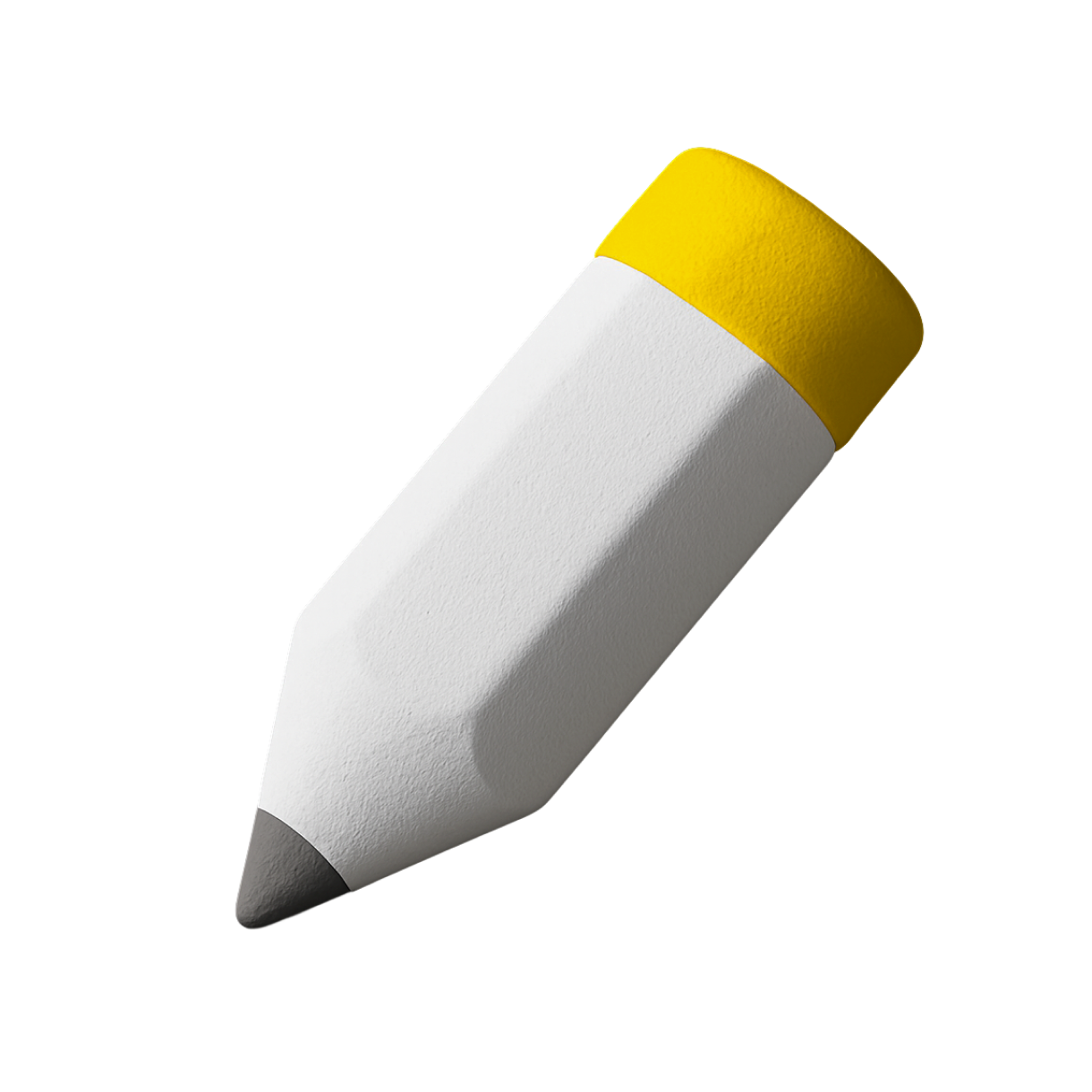
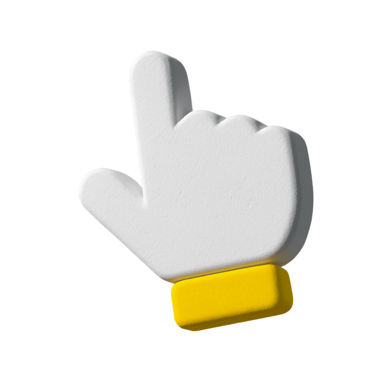
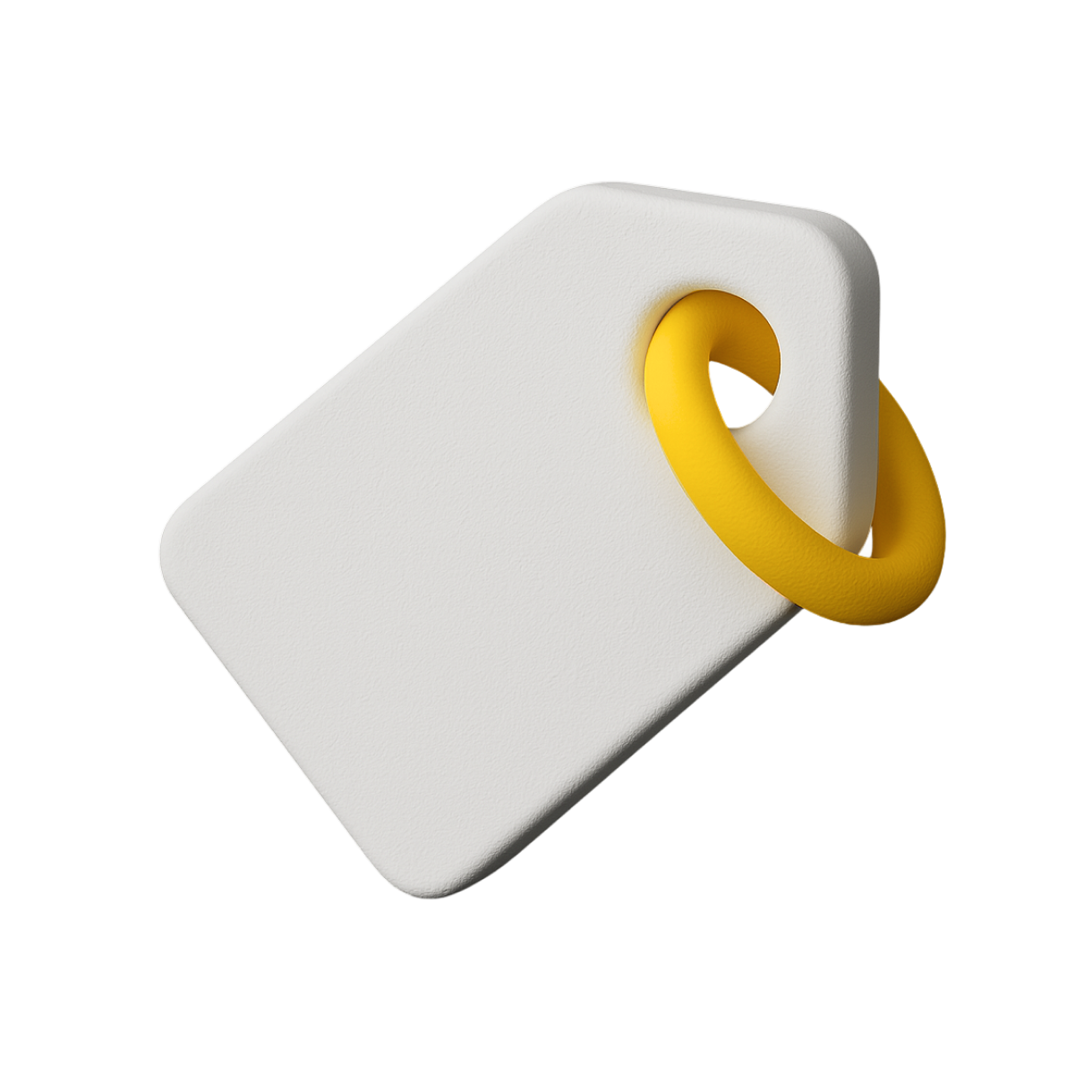
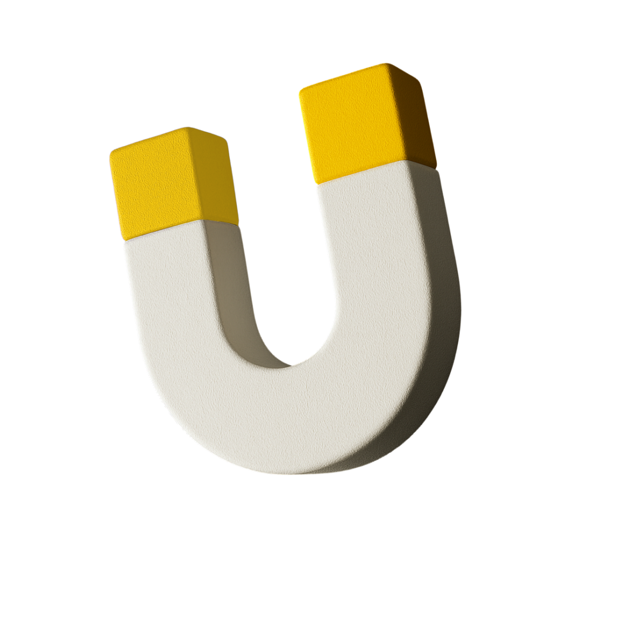
GALTON uses three icon families. (1) SIMPLE — flat geometric marks: a solid yellow fill (e.g. the heart) or a thin white monoline shape with ONE yellow accent element. Minimal, built from basic geometry; used as a single hero mark on dark slides. (2) LINE — a detailed monoline service-icon library, ~2px stroke, square-ish viewBox, one or more #FFD700 accent blocks. Each line icon ships in TWO finishes: `file` is the WHITE-stroke icon for dark surfaces (the brand default, dark-first), and `fileLight` is the same icon with BLACK strokes for light/white surfaces. The yellow accent is identical in both. (3) 3D — soft-shaded white objects on a single yellow base, transparent PNG; works on dark and light. Match a family's stroke weight and the one-accent rule when extending.
Line icons